
For better or worse? Six recent rebrands that highlight current branding trends
Mastercard is the latest to join the trend of removing its name from its logo. Apple, Target and Nike have done it successfully, but can more recent attempts succeed just as well? Mark Emerton, Senior Art Director at Six Black Pens, examines six recent rebrands, in Australia and overseas, to see how successfully current branding trends are being deployed.
1
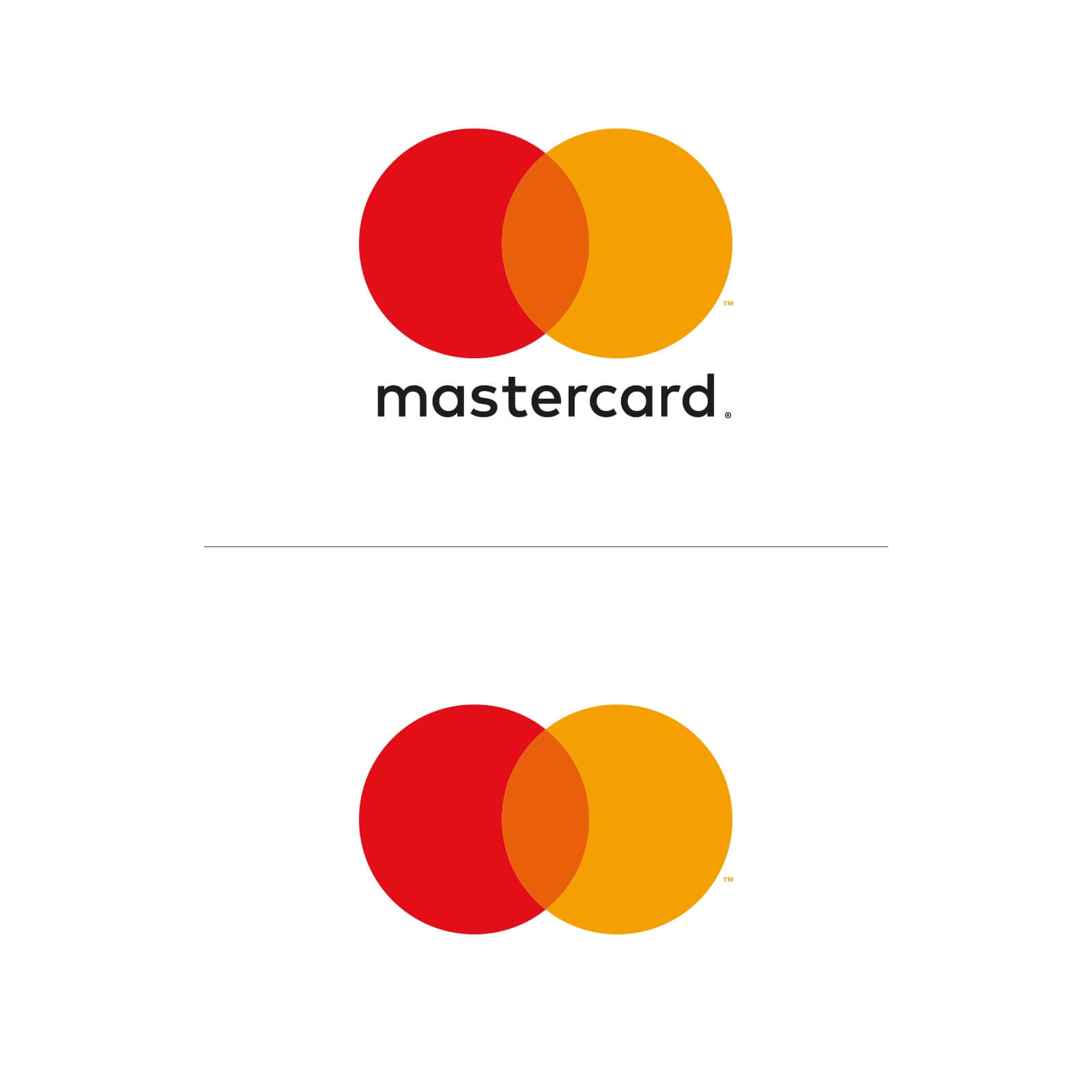
Mastercard
In 1993, as Purple Rain shot through the charts, Prince did something unprecedented. He changed his name – his brand – to an unpronounceable love symbol that blended the traditional gender symbols. He was a master at personal branding and one of the first people to recognise the power of symbol over language when it comes to brand familiarity.
Fast forward 25 years and big corporate brands are catching on. Mastercard is the latest brand to remove its name from its logo. In this case, the deletion acknowledges that plastic cards are quickly going the way of dinosaurs.
The distinctive overlapping circles logo remain but the company name beneath the symbol will no longer appear.
Mastercard diligently researched recognition of its mark by the general public. At the moment, I think it’s well enough known to work without the name. Whether this remains true for younger and future generations, however, remains to be seen.
2
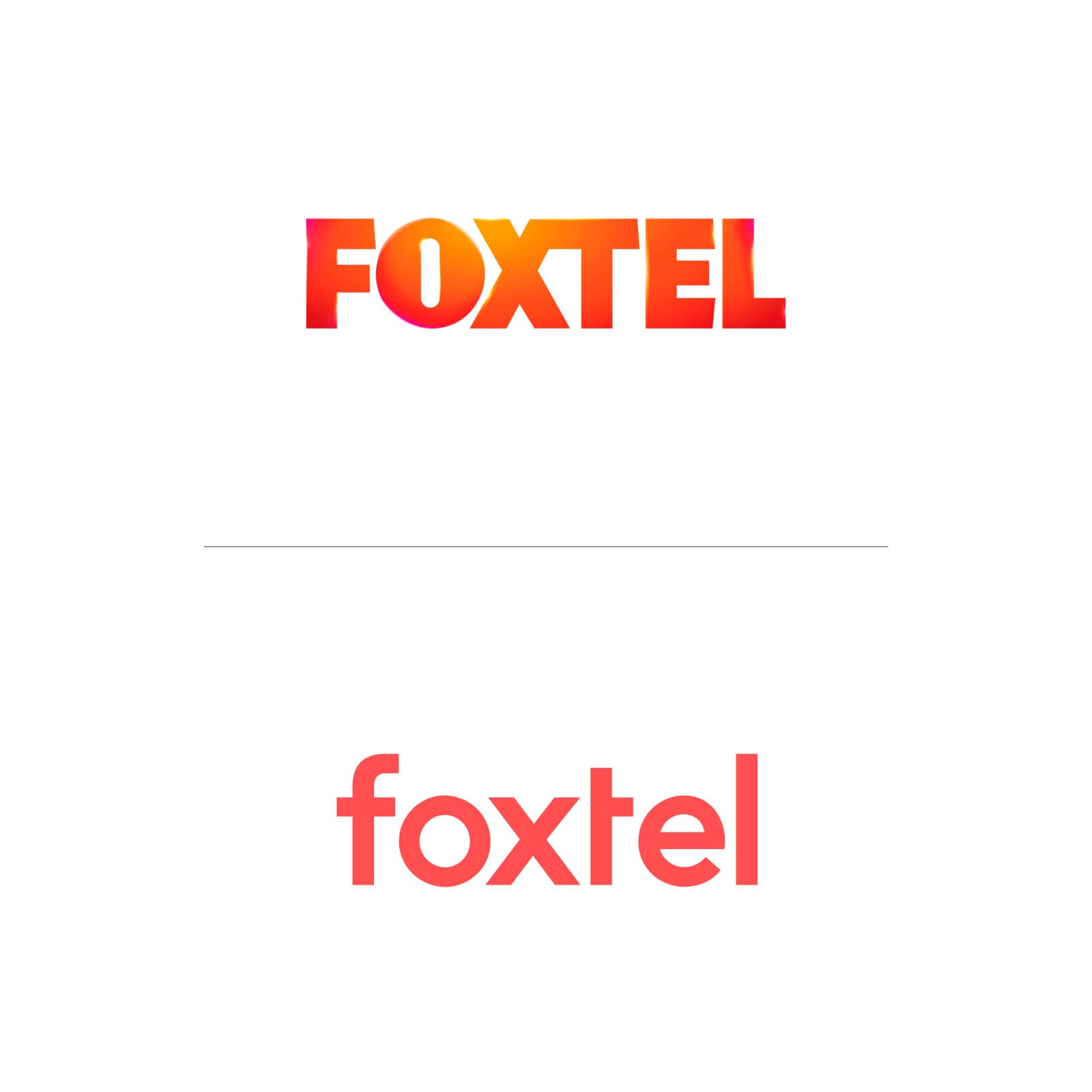
Foxtel
Twenty-two years ago, Foxtel disrupted free-to-air TV in Australia, providing alternative content for Australian consumers.
Since then, the internet has changed our program consumption and access. On-demand service providers introduced millions more people to the pay-TV market and triggered a renaissance in content production.
Foxtel’s latest rebrand forms part of the company’s move from being the aggressive and shouty disrupter to celebrating a more approachable and digitally enabled platform that’s more inclusive.
The new logo, with its softer lower-case font, positions Foxtel as modern, relaxed and progressive, which fits nicely with Australian characteristics. It’s more approachable and playful than the chunky caps of old, which resembled a rugby forward more than anything! The orange has also been softened and is now a trademarked orange, complemented by midnight blue.
3
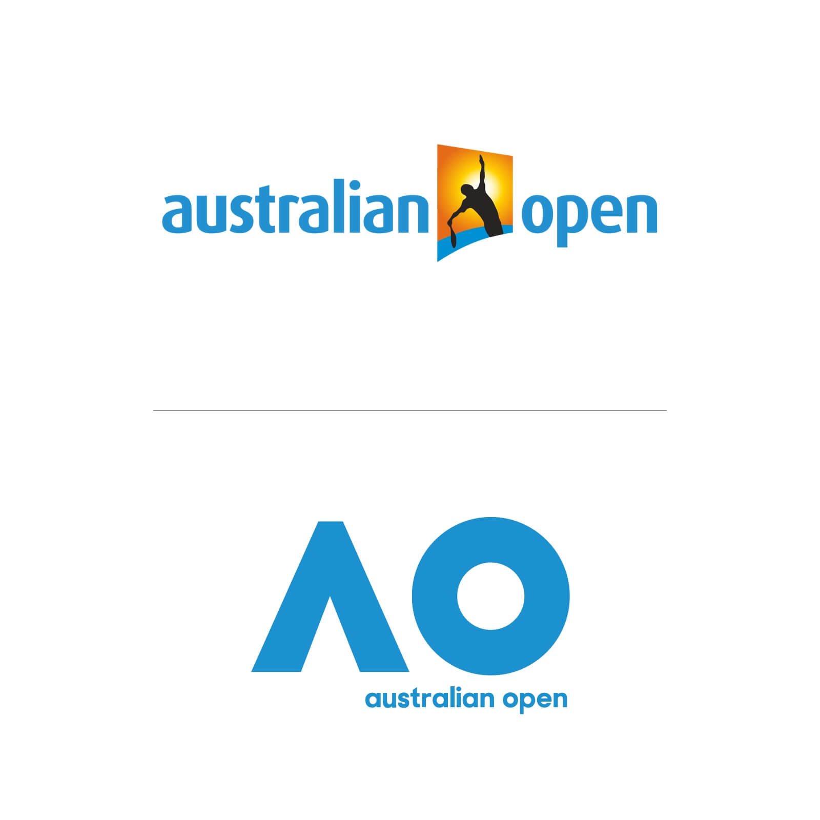
Australian Open
There’s no doubting that the Australian Open branding was outdated. The solution is a trending one: sideline the name in favour of just the initials. However, Australian Open chose not to lose the name entirely but simply reduce its importance in the new branding.
Reflecting the game itself, simplifying the Australian Open logo means it can easily animate and adapt to its environment. This simplicity gives the brand licence to do almost anything – from branding chairs and even tennis balls to large-scale signage and video animations in which the ‘A’ upward arrow morphs into graphic bursts, adding energy to the identity.
4
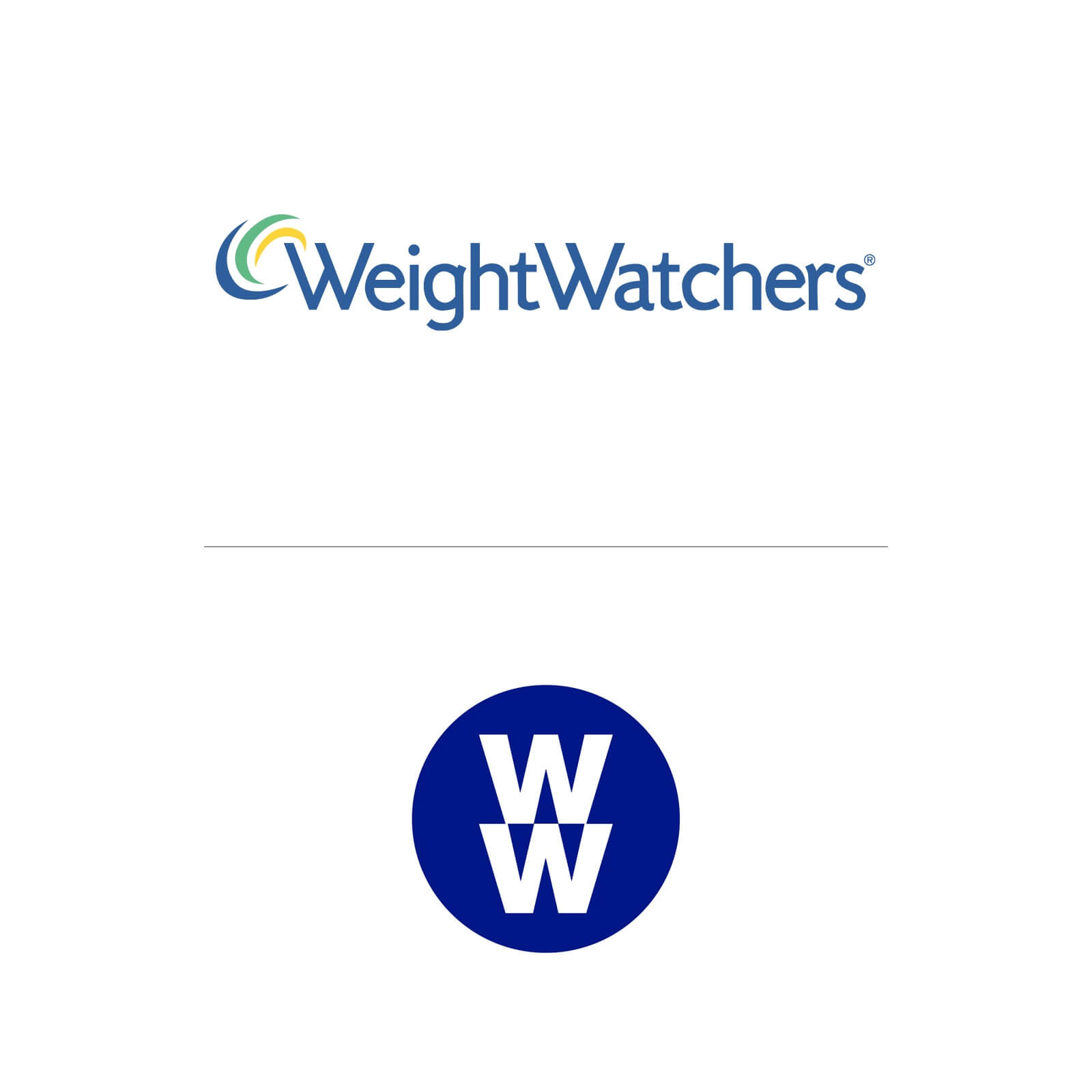
Weight Watchers
The company formally known as Weight Watchers is now simply WW. Attempting to attach itself to the wider wellness trend, Weight Watchers has not only removed its name from the logo but lost it all together. WW now stands for ‘wellness that works’.
According to its press release, WW will now focus less on shedding pounds and more on an overall approach to health and well-being, “inspiring powerful habits rooted in science”.
However, in reality, the public doesn’t associate WW with Weight Watchers, let alone ‘wellness that works’. It’s an unnatural shift requiring a huge public re-education campaign to make it work. And while it’s undeniable that Weight Watchers needed to reposition itself to stay relevant to younger consumers, I think it’s chosen a very risky transition that’s very difficult to pull off. There are no references to its heritage in the new branding – everything from the tone of the blue to the font has changed. ‘Wellness that works’ has a very staid corporate logo that I fear could well suggest ‘waste-a wad’ to the Insta-led wellness generation.
5
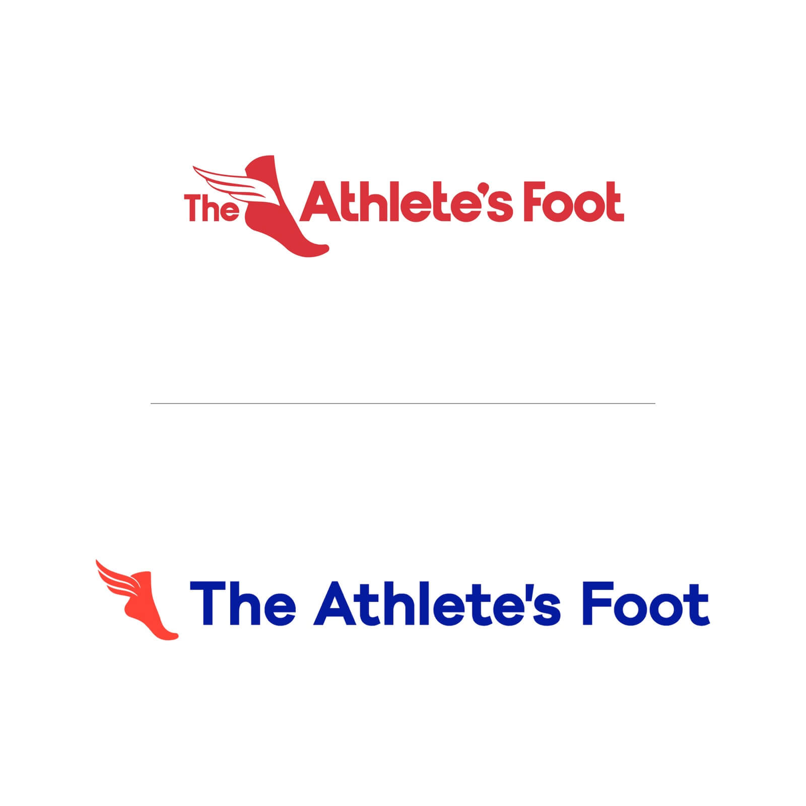
The Athlete’s Foot
How do you reposition a ‘dad brand’ to inspire a new generation of athletes? That was the problem facing The Athlete’s Foot, Australia’s largest retailer of athletic footwear. When your brand has to hold its own next to stock brands like Nike and adidas, it’s a whole lot tougher.
In response to shifting exercise trends, The Athlete’s Foot positioned itself as the place to go for performance shoes that could give your running that extra edge.
I think separating the winged foot mark from the name is a good idea. It can stand alone when co-branding with a product shot or on sponsorship and packaging branding. The typography is more muscular and the colours are energised by changing the blue to cerulean and adding a popping orange tone to the red.
The dot matrix background is interesting. It refers to the company’s unique precision foot-measurement technology and staff’s ability to select the perfect shoe for you. It also helps convey the brand new digital products’ precision. The new tag line ‘Elevate your run’ is a nice touch, too.
6
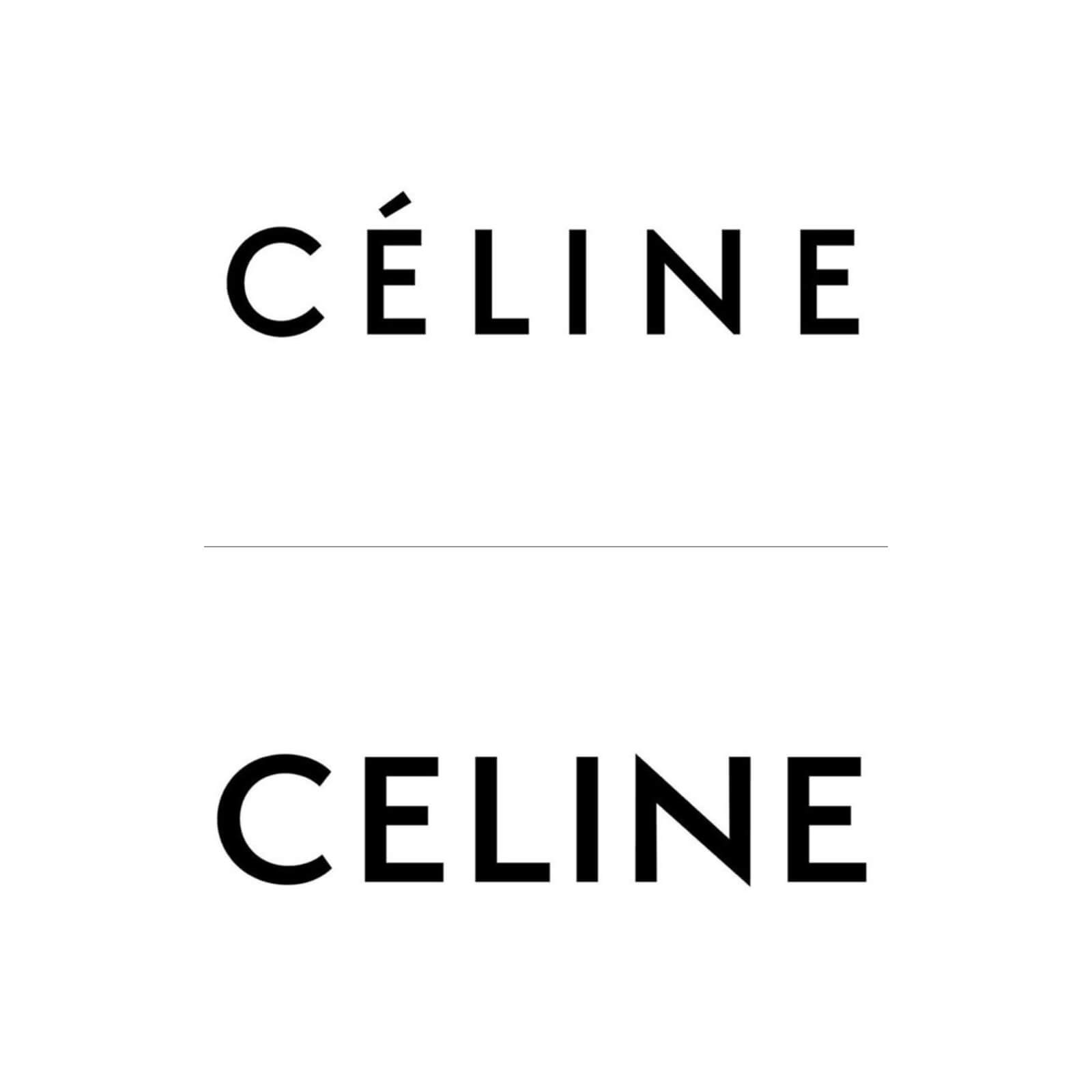
CELINE
When you fork out for items by luxury French fashion brand Céline, you’re buying into a tradition of relaxed yet urbane sophistication. So, when the company decided to drop the accent and become simply Celine, fans around the world declared the change ‘un sacrilège’ and shouted their displeasure across social media.
In my opinion, this is one attempt at ‘modern simplicity’ that hasn’t added much. Instead, it’s taken away the brand values of national provenance and perhaps some of Celine’s ‘je ne sais quoi’, which even for today’s Chinese wearers is undeniably what they pay for.