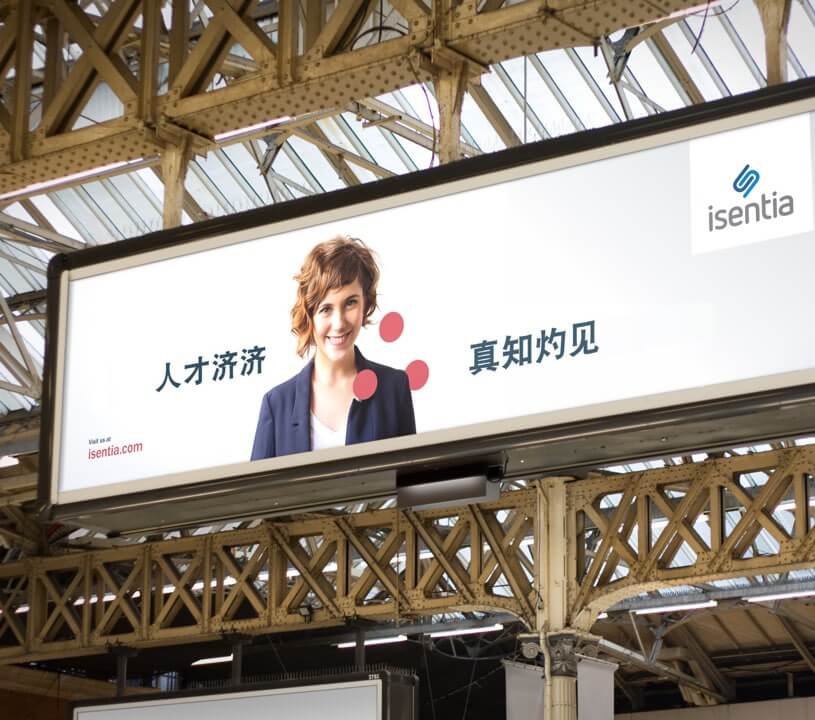
Isentia wanted to evolve away from being seen as a traditional media monitoring business to change mindsets, drive global growth and empower decision-making through key data-based insights and intelligence for clients. We were asked to develop a new brand identity, messaging platform and launch strategy to share the ‘new Isentia’ that would work across the 12 markets in which Isentia is active.
A new brand for Isentia
Scope of work
- Brand
- Tone of voice
- Editorial
- Microsite
- Website design
- Augmented reality
- Video
- Launch
The objective
Reposition Isentia as the reinventor of media intelligence by providing key data-driven insights that empower clients to make the best decisions for their business.
The main goal was to reposition the Isentia brand away from being ‘just an old’ media monitoring business to a generator of real-time data intelligence that can be used for meaningful action, and move the conversation into the present while honouring past success.
Scope of work
- Brand
- Tone of voice
- Editorial
- Microsite
- Website design
- Augmented reality
- Video
- Launch
How we did it
We conducted interviews and workshops to identify the new brand and its challenges. We then formulated the strategic definition of Isentia’s repositioning and how it would work across sub-businesses, markets, and internal and external audiences.
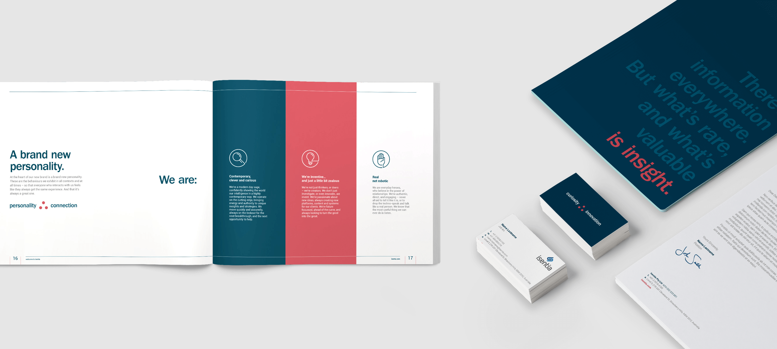
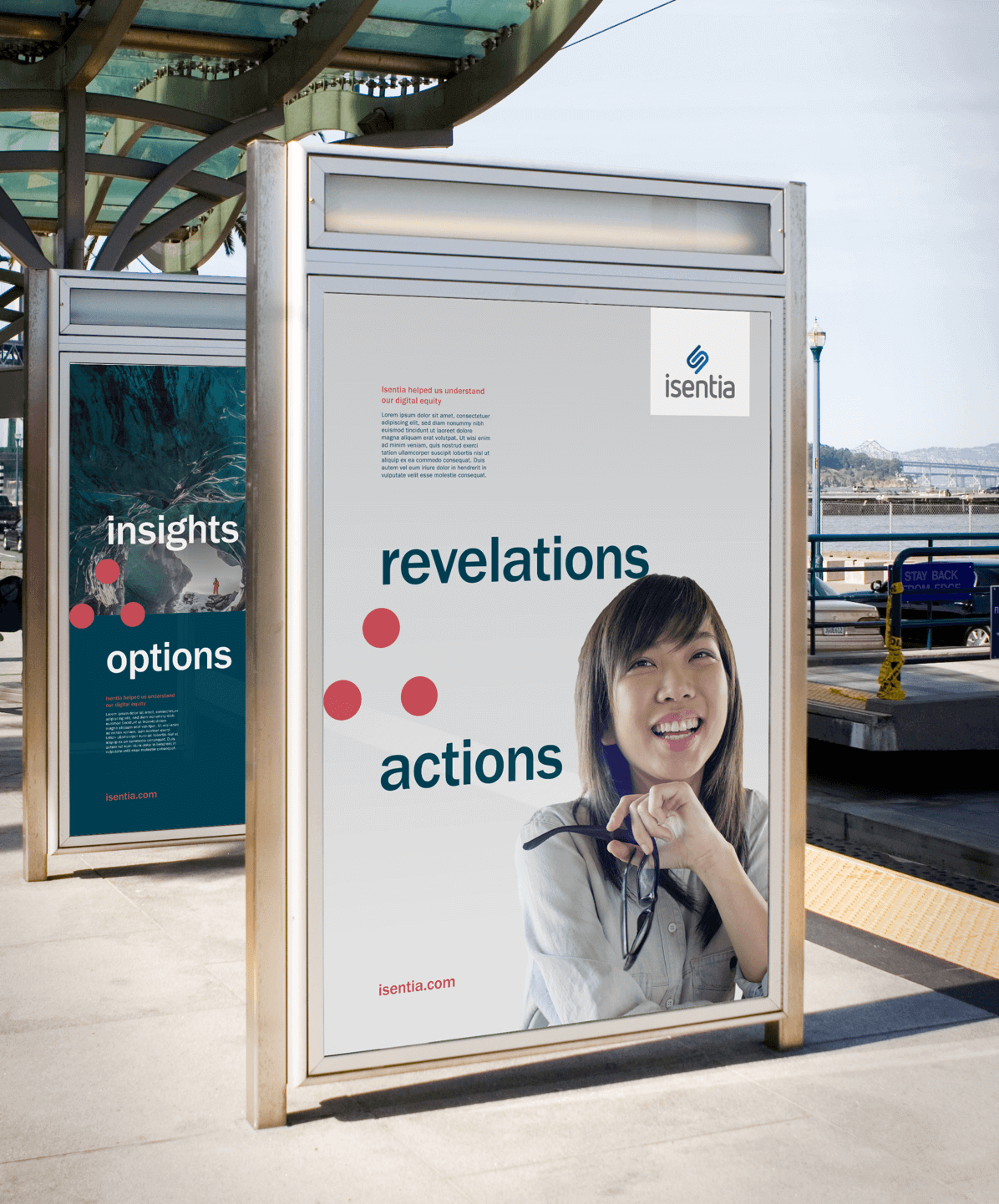
We created a new brand identity and guidelines, a new tone of voice and a creative platform for launch. We also ensured a successful rollout with global internal and customer-focused engagement programs that used multiple touch points to embed the new identity and functionality.

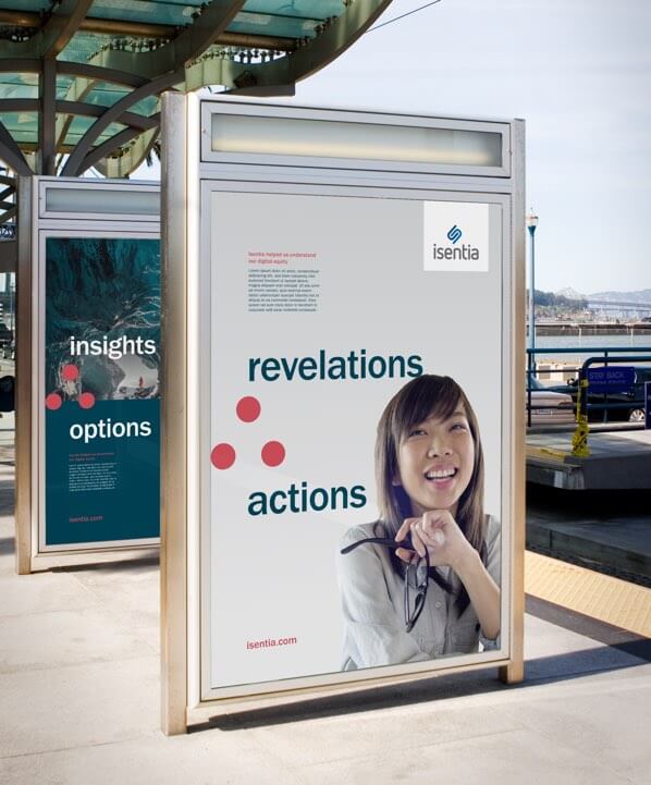
The symbolism of ‘therefore’
Isentia wanted to demonstrate its ability to be a catalyst for change for its clients – the influence that moves a situation from challenge to opportunity.
That’s why we used the mathematical symbol for ‘therefore’ as the iconic symbol of the brand. This universal symbol did more than reflect Isentia’s use of data to identify and solve business problems. It transcended language and cultural barriers by representing the same thing across all the key international markets Isentia works in.
Typography
Isentia’s typography needed to be timeless and adaptable. Franklin Gothic and Roboto Sans were selected as a complementary combination – Franklin Gothic as a traditionally strong display type and Roboto Sans for its grotesk geometry and open curves, which allow for a natural reading rhythm perfect for body copy.
Franklin Gothic Medium and Book

Roboto Sans Light

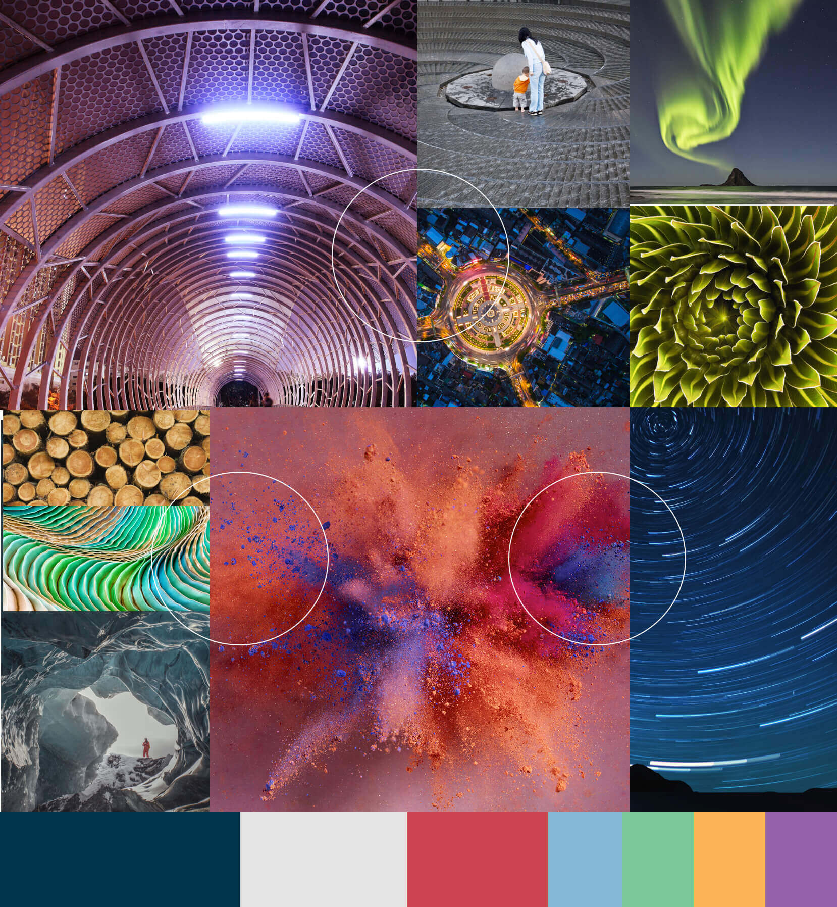
Colour theory
The colour palette brings to life the balance between Isentia’s three defining personality traits.
The sage
Isentia’s heritage and long-standing expertise becomes the solid and dependable Deep Blue.
The creator
Isentia’s creative spark appears as the unexpected lift that Rare Red accents provide.
The everyman
Isentia’s functional and practical side is Light Grey, which doesn’t dominate communications but lets the insights shine through.
Results
Isentia successfully launched the new brand, service positioning and products to their global staff and customers. The launch also resulted in a significant increase in unprompted brand recollection across all markets.

Switched on
Ideas, inspiration and other interesting stuff from the Six Black Pens team.